Wrangling freedive watch data in R
Towards the end of 2021, I finally plucked up the courage to take a freediving course. At the time, I had never even tried Scuba diving, but a love of swimming and a childish love of trying to swim pool lengths underwater, combined with several inspiring videos, was enough for me to give it a try. Since then, my diving has been limited to swimming pools in Amsterdam and very cold, dark Dutch lakes, together with a local dive group. But this year, I finally managed to get to Dahab, Egypt, to help prepare for the depth component of my AIDA3.
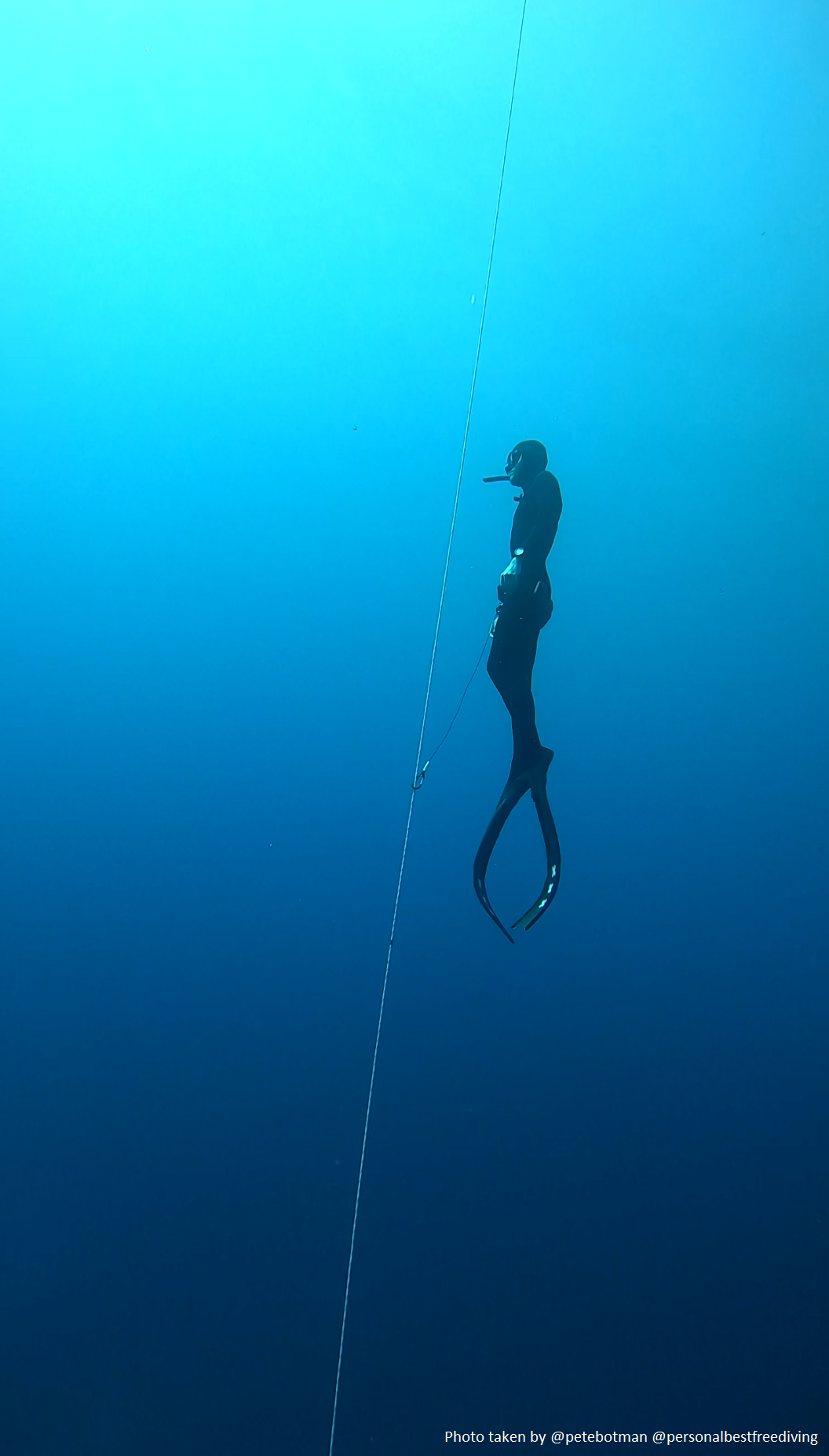
Figure 1: On the ascent in Dahab. Photo taken by Pete Botman. Credit also to Pete for lending me his Amsterdam-themed fins!
Freediving is pretty wholesome, and the gear-free component is part of what I enjoy so much, especially compared to Scuba. But before going to Dahab, I finally succumbed to buying a freedive watch (a Suunto D4F). The watch measures and records basic information about your dive, including important safety information such as your surface interval times. The inevitable problem is that the watch is fairly clumsy when it comes to viewing historical dives. I had all this awesome information on my dives locked away behind a black and white screen and a few buttons. I found the Suunto desktop software pretty outdated and restrictive. Opening it up gave me very Windows 95 vibes (great vibes, but not what I am looking for here).
So, I set about exploring whether the data could be pulled off the watch and summarised using R. The ultimate aim might be to create an app in which people can drag-and-drop their own data. But, let’s not carried away. For now, if you want to replicate what I show below, you can find everything on an open GitHub repository. If you run the code on your own data, please let me know how you found it, and what I could add to improve things. This is very much an initial exploration.
Setup
The first thing you’ll need to do is load in a few packages. Nothing unusual here (mainly tidyverse-based packages). The exception is XML which we need to load in the data.
# Load packages.
library(XML)
library(dplyr)
library(tidyr)
library(stringr)
library(lubridate)
library(ggplot2)
Loading and parsing
Each dive is archived into its own XML file. This means that even just for this year, I have 102 individual XML files. This is rather annoying but easily resolved by pasting together the working directories of all of these files based on their extension (i.e., .xml). If you use the corresponding GitHub repository, and work within the project file, all of this will run nice and smoothly. Nested within paste() is the list.files() function which simply produces a character vector for all the XML files in the specified folder. You can use this approach for any file type you want.
# List files.
dive_files <- paste("data/2023/", list.files("data/2023/", pattern = glob2rx("*.xml"),  recursive=TRUE), sep = "")
Now that we have all the working directories stored within the dive_files list object, we can run the xmlParse() function through the whole thing. This produces a list of XML documents, which we then further parse using xmlToList(). The output dive_list is a list of lists, but bear with me: we extract the useful information in one beautiful swoop in the next step.
# Load data.
dive_xml_list <- lapply(dive_files, xmlParse)

# Parse into a list of lists.
dive_list <- lapply(dive_xml_list, xmlToList)
The pull function
This step is basically the only challenging part of the process. I would love someone with more experience in wrangling XML files to improve this. At the moment, I run a function which, for each dive record, creates a tibble containing the bits of information that we need, such as the date of the dive, the depth of dives, duration and temperature.
The one thing that makes this odd, and involving yet more lists, is that the watch measures depth and temperature at specified time intervals (a sampling rate) of two-seconds. Nevertheless, we can pull these out using lapply() and then convert to a numeric vector within this tibble() function. We also do some trivial extras, like convert the depth readings to a negative number. This function is the key to extracting your dive data in a usable tidy format.
# Function to pull out relevant information.
pull_fun <- function(x){
tibble(
    mode  = x[["Mode"]],
    date  = x[["StartTime"]],
    depth = as.numeric(lapply(x[["DiveSamples"]], function(y){y$Depth})),
    time  = as.numeric(lapply(x[["DiveSamples"]], function(y){y$Time})),
    max_depth   = as.numeric(x[["MaxDepth"]]),
    depth_minus = depth*-1,
    max_depth_minus = max_depth*-1,
    duration  = as.numeric(x[["Duration"]]),
    temp  = as.numeric(lapply(x[["DiveSamples"]], function(y)y$Temperature))
  ) %>%
    mutate(date = str_replace_all(date, "T", " "),
           date_lub = ymd_hms(date),
           date_lub_min = round_date(date_lub, "minute"),
           date_day = round_date(date_lub, "day"))
}
Now for the magic: running this function through the list(s), and sticking it all together into a single tibble.
# Run function through list.
dive_df_list <- lapply(dive_list, pull_fun)

# Bind together.
dive_info_df <- bind_rows(dive_df_list, .id = "dive_id")
In case you are not running this as we go along, the output looks like our ol’ familiar data frames with rows and columns. The data frame is in long format: we have two-second samples nested within each dive id. This is just the first ten rows.
| dive_id | mode | date | depth | time | max_depth | depth_minus | max_depth_minus | duration | temp | date_lub | date_lub_min | date_day |
|---|---|---|---|---|---|---|---|---|---|---|---|---|
| 1 | 3 | 2023-01-15 11:18:09 | 1.58 | 0 | 2.01 | -1.58 | -2.01 | 7 | 6.999994 | 2023-01-15 11:18:09 | 2023-01-15 11:18:00 | 2023-01-15 |
| 1 | 3 | 2023-01-15 11:18:09 | 1.92 | 2 | 2.01 | -1.92 | -2.01 | 7 | 6.999994 | 2023-01-15 11:18:09 | 2023-01-15 11:18:00 | 2023-01-15 |
| 1 | 3 | 2023-01-15 11:18:09 | 1.70 | 4 | 2.01 | -1.70 | -2.01 | 7 | 6.999994 | 2023-01-15 11:18:09 | 2023-01-15 11:18:00 | 2023-01-15 |
| 1 | 3 | 2023-01-15 11:18:09 | 0.92 | 6 | 2.01 | -0.92 | -2.01 | 7 | 6.999994 | 2023-01-15 11:18:09 | 2023-01-15 11:18:00 | 2023-01-15 |
| 2 | 3 | 2023-01-15 11:23:29 | 1.22 | 0 | 2.57 | -1.22 | -2.57 | 7 | 6.999994 | 2023-01-15 11:23:29 | 2023-01-15 11:23:00 | 2023-01-15 |
| 2 | 3 | 2023-01-15 11:23:29 | 2.27 | 2 | 2.57 | -2.27 | -2.57 | 7 | 6.999994 | 2023-01-15 11:23:29 | 2023-01-15 11:23:00 | 2023-01-15 |
| 2 | 3 | 2023-01-15 11:23:29 | 2.54 | 4 | 2.57 | -2.54 | -2.57 | 7 | 6.999994 | 2023-01-15 11:23:29 | 2023-01-15 11:23:00 | 2023-01-15 |
| 2 | 3 | 2023-01-15 11:23:29 | 1.31 | 6 | 2.57 | -1.31 | -2.57 | 7 | 6.999994 | 2023-01-15 11:23:29 | 2023-01-15 11:23:00 | 2023-01-15 |
| 3 | 3 | 2023-01-15 11:27:32 | 1.90 | 0 | 7.32 | -1.90 | -7.32 | 23 | 6.999994 | 2023-01-15 11:27:32 | 2023-01-15 11:28:00 | 2023-01-15 |
| 3 | 3 | 2023-01-15 11:27:32 | 2.80 | 2 | 7.32 | -2.80 | -7.32 | 23 | 6.999994 | 2023-01-15 11:27:32 | 2023-01-15 11:28:00 | 2023-01-15 |
One thing I noticed here is that the maximum depth is often not recorded in one of the two-second samples. For example, in first dive (which was probably just a practice duck dive), the max depth is 2.01 metres but none of the four samples include this depth measurement. I can only guess that the sampling rate is more frequent, but that the watch only saves the two-second intervals and the max depth.
Anyway, as we can already see, not all of these 102 dives were ‘proper’ dives. I know for sure that two of them are Scuba dives, and many of them will be dives for which I was a safety buddy. The Scuba dives are easily identifiable by the ‘mode’. To filter out safety dives, I have simply subsetted the data for dives which were shallower than eight metres. This is completely arbitrary: some of my safety dives will have been deeper, and some of my ‘proper dive’ attempts will have been shallower, but you can choose whatever threshold you’d like.
# Remove SCUBA dives, and likely safety-buddy dives.
dive_info_clean_df <- dive_info_df %>%
  filter(mode == 3, max_depth > 8) %>%
  mutate(dive_id = as.numeric(dive_id))
Dive profile
With the data in tidy format, things get easier and more fun. The main graphic I wanted to create is a ‘dive profile’ visual for which we plot the depth on the Y-axis and the duration on the X-axis using ggplot2. In this plot, I colour the line according to the depth, which is measures at the two-second sampling rate.
# Plot dives profile.
dive_info_clean_df %>%
  ggplot(data = .) +
  geom_line(mapping = aes(x = time, y = depth_minus, group = dive_id, colour = depth_minus),
            size = 1, alpha = 1) +
  scale_colour_viridis_c() +
  scale_x_continuous(breaks = c(0, 15, 30, 45, 60, 75, 90, 105)) +
  theme_bw() +
  geom_hline(yintercept = 0, linetype = "dotted") +
  labs(y = "Depth (metres)", x = "Time (seconds)") +
theme(legend.position = "none") 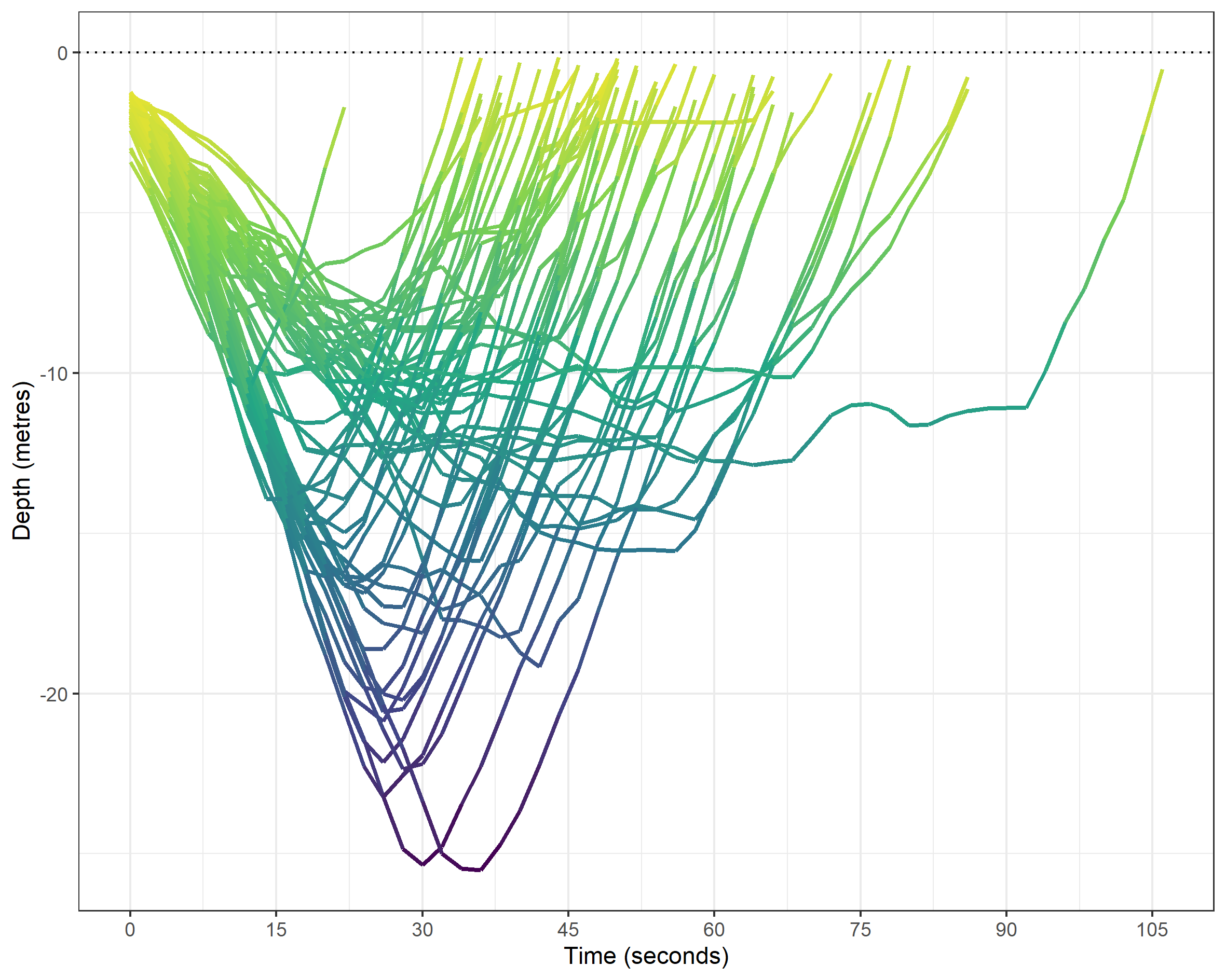
Most of these dives will have been following a vertical rope for safety, as per the photo above. One downside of the dive profile graphic is that at first glance it might imply that the dives are covering distance along the X-axis. But, I think with the proper labeling it is a nice visual representation of the dives. We can easily differentiate outliers by both time (such as a hang at around 12 metres) and my two deepest dives (both are ~25 metres). Any other ideas, let me know. One thing I’d like to fix is the colouring by depth: at high resolution, we can see the segments for the sampling rate. I’d rather it was a smooth gradient colour. But, we go some way to remedy this later.
Chronology
To explore progression over time (which for this data, is only 2023), I create a chronological id variable based on the dates. The order of the dives is interesting, but not so much the date itself. Maybe there’s a nicer way of doing this, but it certainly made the plot later easier. The idea is to later plot max depth progression in chronological order.
# Create chronological id and join back with the main data.
dive_info_clean_df <- dive_info_clean_df %>%
  distinct(date_lub) %>%
  mutate(chrono_id = 1:nrow(.)) %>%
  right_join(dive_info_clean_df)
We can then visualise, by each dive, the max depth using an (upside down) lollipop graphic.
# Basic chronology plot.
dive_info_clean_df %>%
  distinct(chrono_id, max_depth_minus, .keep_all = TRUE) %>%
  ggplot(data = .) +
  geom_segment(mapping = aes(x = chrono_id, xend = chrono_id,
                             y = 0, yend = max_depth_minus)) +
  geom_point  (mapping = aes(x = chrono_id, y = max_depth_minus)) +
  geom_hline(yintercept = 0, linetype = "dotted") +
  theme_bw() +
labs(x = "Dive number (chronological)", y = "Depth (metres)") 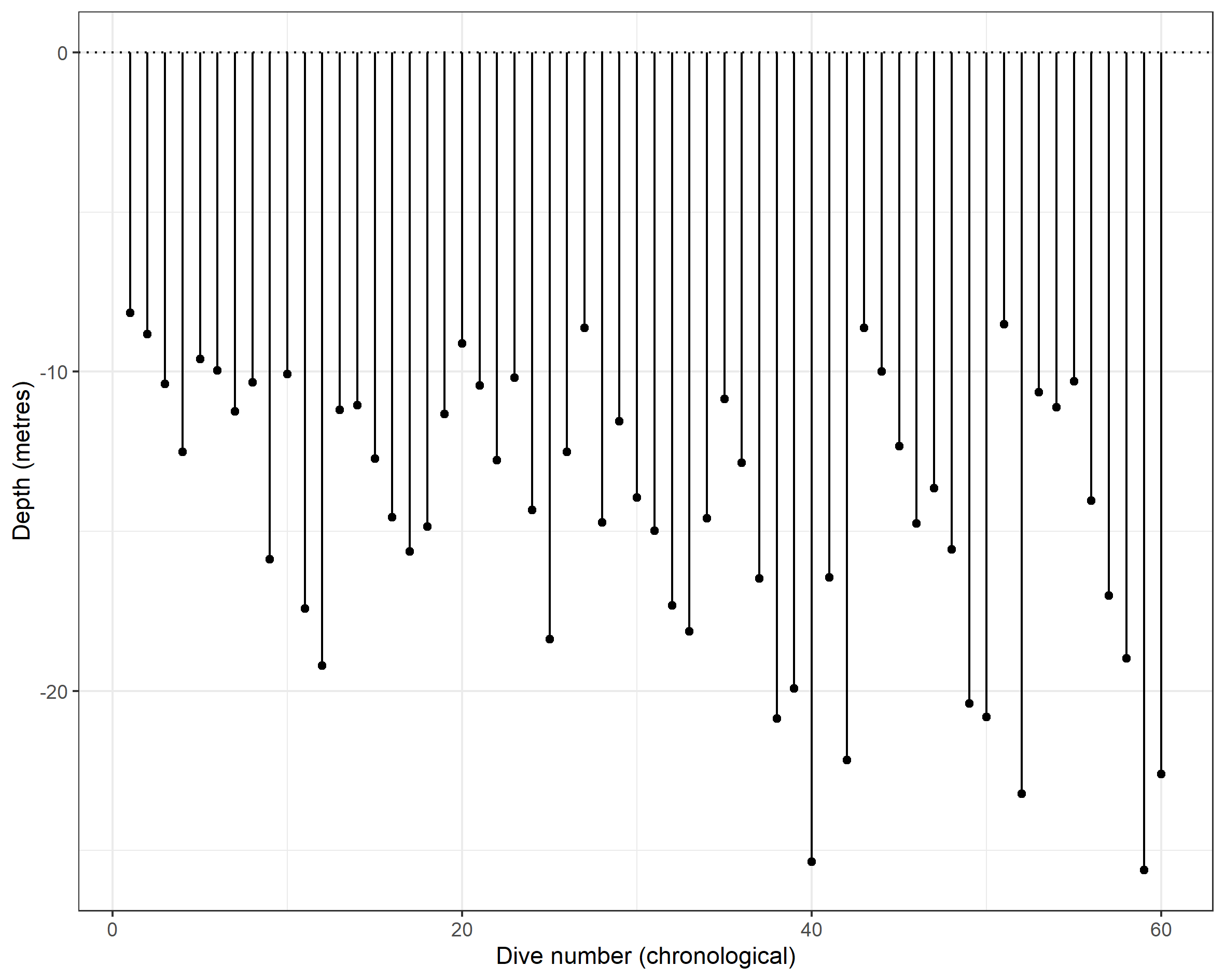
This might prove useful in its own right, but it lacks the colour which perfectly (for me) represents the depth. The deeper you go, the darker it gets. I came up with a rather messy way of adding incremental depth measurements between zero metres (i.e., the surface) and the max depth (the turn on the line). I do this using the seq() function, specifying a sequence of 0.5 metres. This is nested within sapply() so that we generate the sequence for each dive record. The output is a list, so I then convert the sequence to a character, remove the c( and ) sandwiching the sequence, and pivot to long format by splitting rows by the comma. The final step is to make each value negative again.
# Add incremental steps to the max_depths.
dive_sequence_df <- dive_info_clean_df %>%
  mutate(depth_sequence = sapply(dive_info_clean_df$max_depth, function(x)seq(0, x, by = 0.5))) %>%
  select(chrono_id, depth_sequence) %>%
  mutate(depth_sequence = as.character(depth_sequence),
         depth_sequence = str_sub(depth_sequence, 3, -2)) %>%
  separate_rows(depth_sequence, sep = ",") %>%
  mutate(depth_sequence = -1*as.numeric(trimws(depth_sequence)))
We can reproduce the chronology plot but colour the line according to the sequence, with a minor addition to the basic ggplot2 code chunk. You’ll notice that I create a mini data frame beforehand which contains only the chrono id and the max depth measure. This lets me add (coloured) points to the end of each line, but perhaps there’s some smarter ggplot2 code that would avoid the pre-step.
# Identify the max depth for each chrono id.
max_depth_chrono_df <- dive_sequence_df %>%
  group_by(chrono_id) %>%
  summarise(max_depth_minus = min(depth_sequence))

# Plot the sequence graph again.
ggplot() +
  geom_line(data = dive_sequence_df, mapping = aes(x = chrono_id, y = depth_sequence, group = chrono_id,
                          colour = depth_sequence), size = 2) +
  geom_point(data = max_depth_chrono_df,
             mapping = aes(x = chrono_id, y = max_depth_minus,
                           colour = max_depth_minus), size = 3) +
  geom_hline(yintercept = 0, linetype = "dotted") +
  scale_colour_viridis_c() +
  theme_bw() +
  labs(x = "Dive number (chronological)", y = "Depth (metres)") +
theme(legend.position = "none") 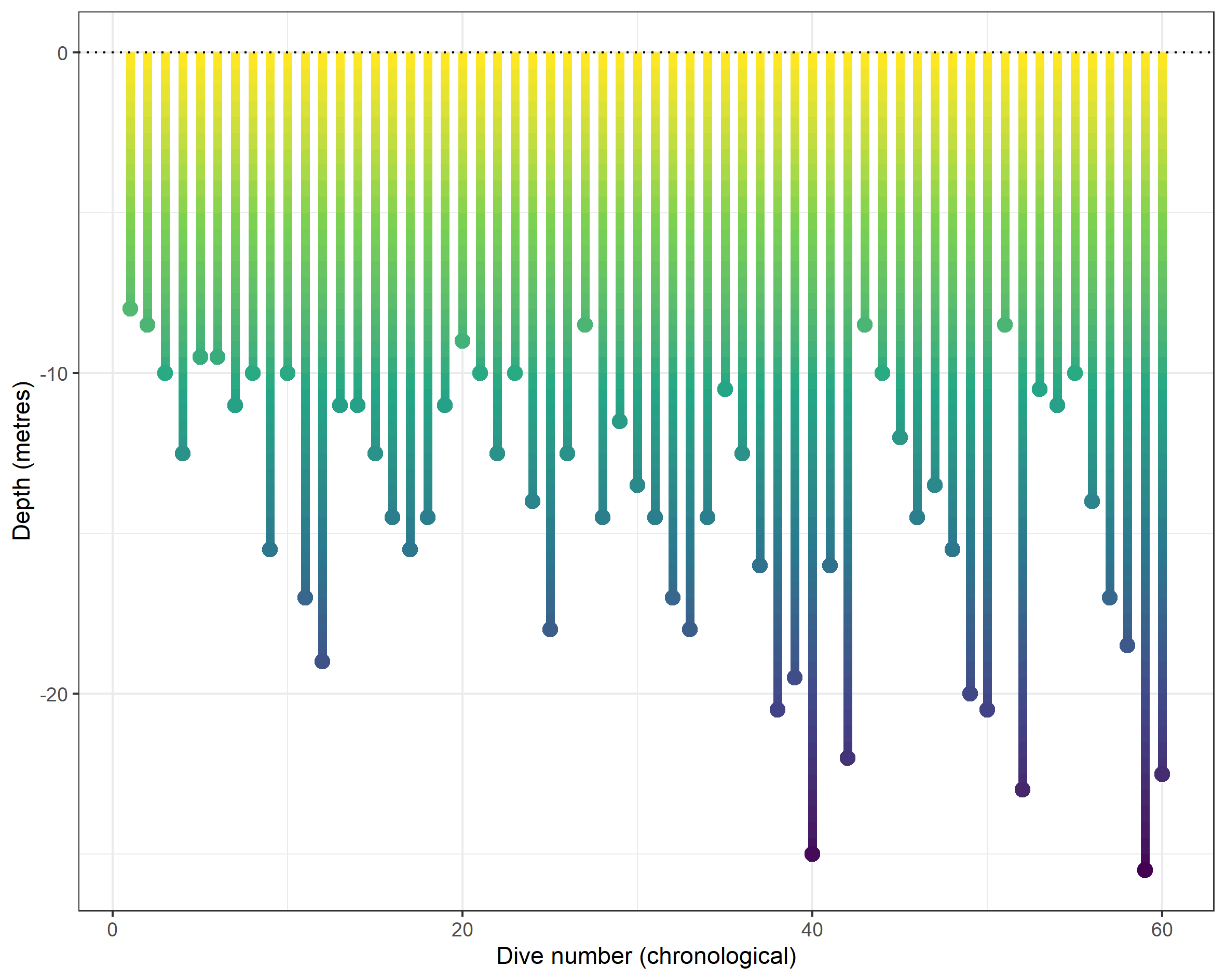
Finally, we can summarise the distribution of max depth, along with the temperature of the water and duration of each dive. This step is pretty straightforward. The pivot_longer() means that we can facet_wrap() rather than create each plot individually.
# Distribution handling and plot.
dive_info_clean_df %>%
  select(dive_id, duration, max_depth, temp) %>%
  distinct() %>%
  rename(`Duration (seconds)` = duration,
         `Max. depth (metres)`  = max_depth,
         `Temperature (C)` = temp) %>%
  pivot_longer(cols = -dive_id, names_to = "stat") %>%
  ggplot(data = .) +
  geom_density(mapping = aes(x = value), fill = "grey20", colour = "grey20") +
  facet_wrap(~stat, scales = "free") +
  theme_bw() +
  labs(x = NULL, y = NULL)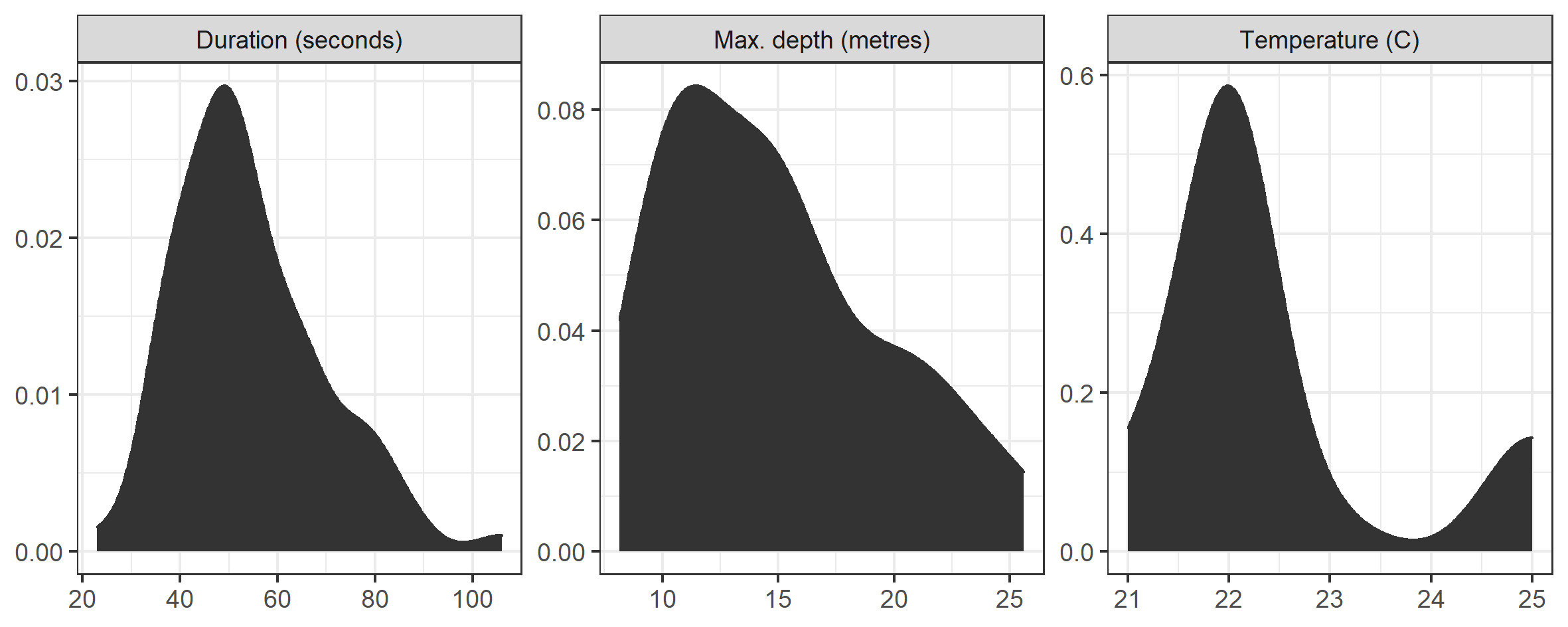
Well, that’s pretty much it for now! It’s a start. The code should work pretty seamlessly for anyone with a Suunto D4F, but the drag-and-drop dashboard might be a long way off yet. This is partly because I don’t know to what extent this code will run on dive logs from different brands and model of watch. If you get it running using your own data (irrespective of the watch model) let me know!
Samuel Langton
I am currently a Lecturer in Quantitative Criminology at the University of Manchester. I have previously worked as a postdoc at the NSCR and a research software consultant at Amsterdam UMC.