Scraping 'most read' stories from the BBC
I have had a long-time fascination with the BBC website’s top ten most read table. The most trivial of stories appear to usurp critical world events, spending hours (or days) at number one. Stories also seemingly disappear or reappear under different names. Assuming the table is dictated entirely by users’ clicks, it is a window into the priorities and interests of BBC’s readership. It is also possible that there is some manipulation by editors, such as adding a weighting (e.g., newer stories do not need as many clicks to enter the top 10 compared to older stories). Either way, it’s pretty interesting.
Without behind-the-scenes access to what is actually going on, I began scraping the top 10 ‘most read’ table from the BBC website (thanks to Danielle Stibbe for help on HTML nodes!). The scrape ran every five minutes, 24 hours a day. The time span is patchy due to my own errors and IT trouble, but on-and-off it runs from November 2023 to February 2024. On each scrape, a script cleans and saves the top ten table as a .csv file. Later versions of the script also include the URL of the story itself. That’s a lot of information – far too much for me to know what do with. I’ve made the data completely open so that people with more time and expertise than me can make use of it for research or teaching. If you do make use of it, please let me know!
For now, here’s a brief demonstration of the scraped data. All of these findings can be reproduced and edited (for your own topics of interest) using the data and code on the GitHub repository. I’ve used an example time period of 10 January to 9 February, 2024. This is one month of continuous scraping (~8,500 files).
A very obvious thing you can do is just look at the number of scrapes – and therefore, the amount of time – that stories spent in the top ten during the scraping period. To do this, I just calculate the number of scrapes within which the story was featured (in the table: n) and then multiply by five (minutes). This of course assumes that, if a story appeared in a scrape, it remained in the top ten for five minutes. Here, then, we can see the story that spent longest in the top ten (~40 hours) was about protesters throwing soup at a painting, joint with a story about some twins on TikTok. To me, this is surprisingly dynamic: things do not stick around in the top ten long.
| article_title | n | mins | hrs |
|---|---|---|---|
| Protesters throw soup at Mona Lisa painting | 483 | 2415 | 40.2 |
| Twins separated and sold at birth reunited by TikTok | 483 | 2415 | 40.2 |
| Swedish alarm after defence chiefs’ war warning | 458 | 2290 | 38.2 |
| Huge ancient city found in the Amazon | 437 | 2185 | 36.4 |
| Stunning shot of polar bear drifting to sleep wins award | 430 | 2150 | 35.8 |
We can do the same thing but for each ranking position (i.e., one to ten). Here, we subset only for those stories that ever reached number one. Note that this relies on a similar assumption about time in-between scrapes.
| article_title | n | mins | hrs |
|---|---|---|---|
| Twins separated and sold at birth reunited by TikTok | 165 | 825 | 13.8 |
| Swedish alarm after defence chiefs’ war warning | 158 | 790 | 13.2 |
| Protesters throw soup at Mona Lisa painting | 139 | 695 | 11.6 |
| Netanyahu publicly rejects US push for Palestinian state | 136 | 680 | 11.3 |
| King Charles diagnosed with cancer | 135 | 675 | 11.2 |
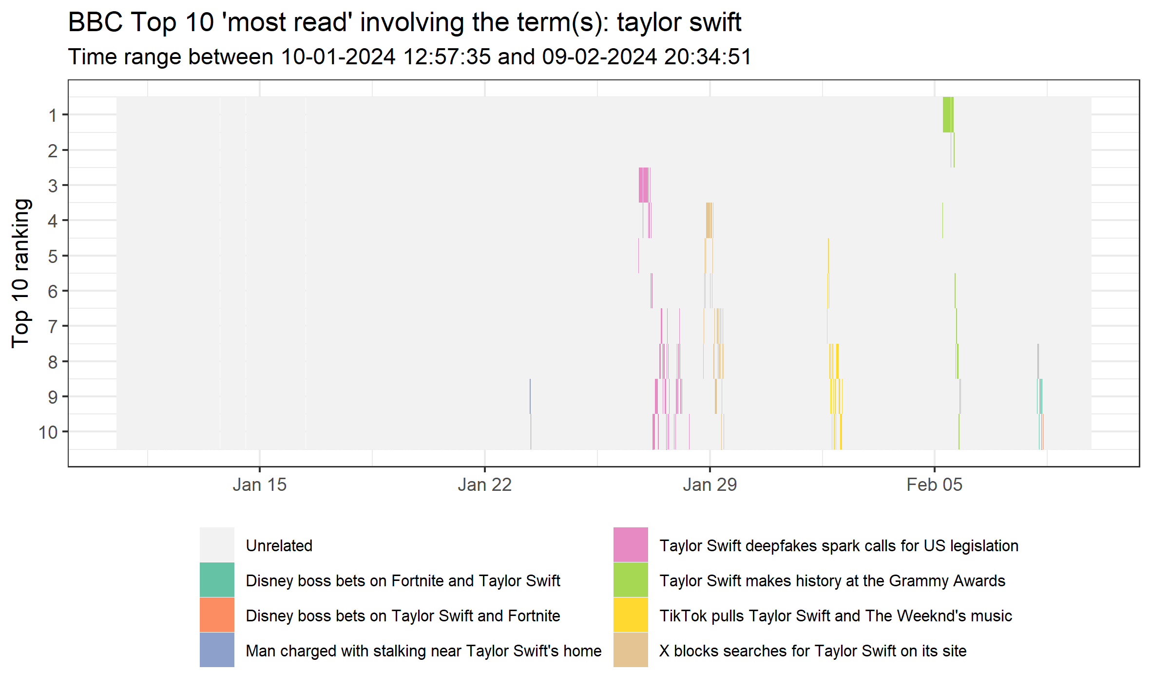
My favourite thing is to visualize the sequence of story rankings during the time period for specific topics. I do this simply by using a basic string detect for keywords. To keep the visual simple, I limit the number of individual stories visualized to six. This leaves room for an ‘Unrelated’ category (i.e., not keywords) and an ‘Other’ category for the least common but still related stories (if there are any). You can amend this as wished using the script. This script is as automated as I can make it: it will update according to the time period, number of stories, and keywords used. Below, we visualize the sequences of stories involving the term ‘Taylor Swift’ during the entire month.
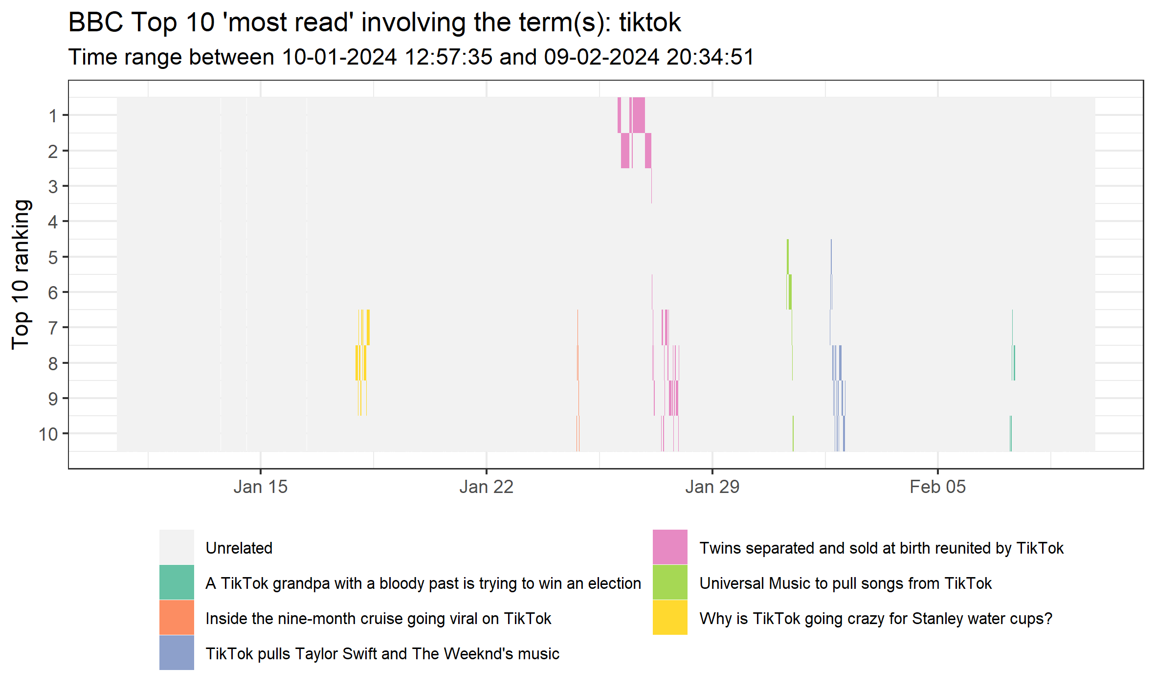
Or something that we’ve already seen is popular: TikTok. Note that this is all case-insensitive.
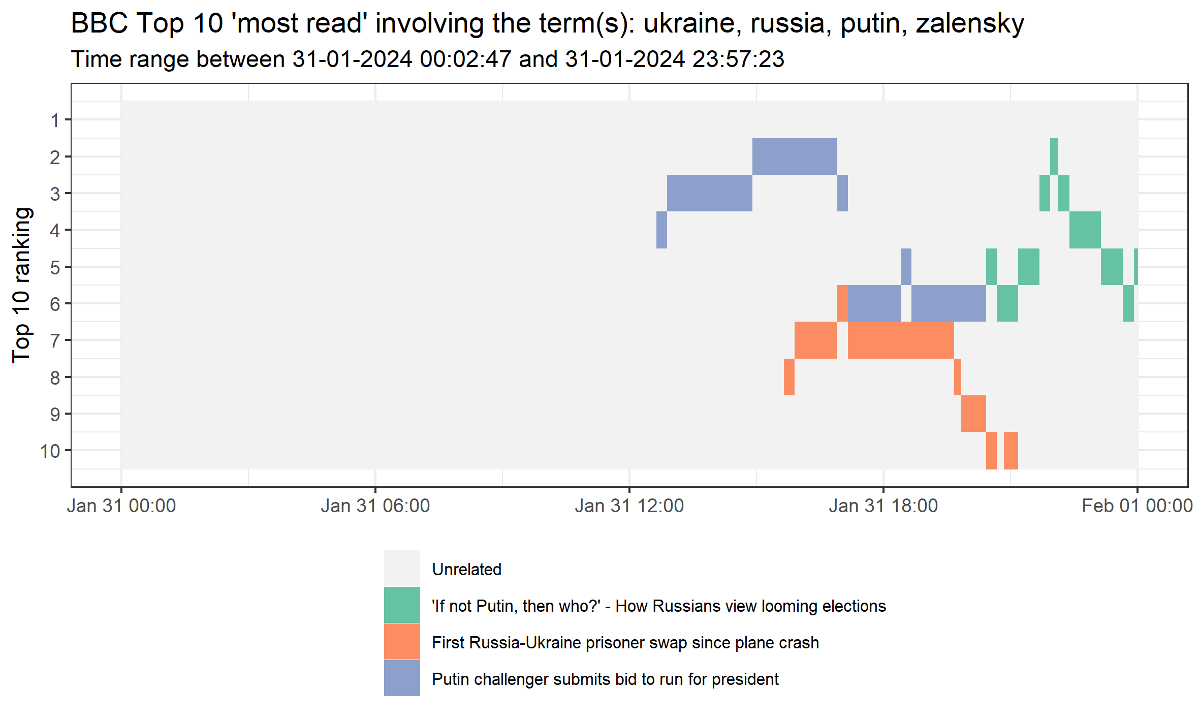
We can also select specific days and use multiple keywords. In this case, we capture a handful of words relating to Ukraine-Russia on 31 January, 2024.
Obviously, there is far more that can be done with this data, but this provides a brief overview. One thing I have explored is comparing two topics over time (see script). This way, you could assess whether certain topics decline in popularity over time, at the expense of others. For lengthy scraping periods, I think the data will require much more data handling to simplify before making a meaningful visual, or more sophisticated text analysis to identify clusters of stories. Anyway, please feel free to explore the data yourself. If you have any interesting ideas, or use the data for something fun, please do get in touch!
Samuel Langton
I am currently a Lecturer in Quantitative Criminology at the University of Manchester. I have previously worked as a postdoc at the NSCR and a research software consultant at Amsterdam UMC.